
The role
The first Latin American startup accelerated by Y Combinator. I joined as the only designer and front-end engineer right after the YC batch, and stayed for four years and two pivots.
Glio went from a local business review platform, to a payments solution for international companies selling in Brazil, to a beauty marketplace built to be the Amazon of Latin America at the lowest prices in the market.
The bet (final pivot)
Brazilian e-commerce in 2015 had a trust problem. Marketplaces like Mercado Livre showed dozens of listings for the same product at different prices, with no clear signal of which seller to trust. The experience created friction and protected incumbents.
We bet on a single-listing marketplace: one product, one price, always the lowest available in real time. The model would convert better than the standard, even at margin levels that scared most operators.
The result
In the marketplace phase:
- 20% MoM growth.
- Conversion from 1.5% to 5% — a 233% increase, well above industry benchmarks of 2–4%.
- 80+ Net Promoter Score.
The work behind the numbers:
- Designed the product end-to-end and shipped the front-end code (HTML/CSS/JS) for web and mobile.
- Ran more than 2,000 A/B and multivariate tests in four years.
- Built the experimentation practice from scratch — hypothesis framework, prioritization, and qualitative research alongside quantitative tests.
The lesson
Two years into aggressive experimentation, the product started losing craft. Velocity was high but the design was eroding. We had optimized for shipping at the expense of quality.
I slowed the pace of A/B tests to invest more time in the design stage and to deepen user research before each experiment. The bet was that better hypotheses would compensate for fewer tests. It worked: assertiveness went up, results held, and the product recovered its craftsmanship.
This is the part of Glio I think about most. Speed and quality aren't opposites, but treating them as if they are has a cost — and the cost is invisible until it isn't.
Before the marketplace
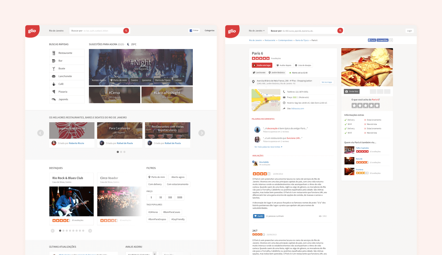
Glio for Local Business (2013–2015). Started as a local business review platform — Yelp for Latin America. I redesigned the platform from the ground up, removed unnecessary features, and focused on the two flows that mattered: search and reviews. It was the first time we used metrics and A/B testing.
Glio Payments (2015). A brief pivot into a payments solution that let international companies sell in Brazil and issue Brazilian invoices without opening a local entity. In four months, I designed the logo, the website, the plug-and-play checkout, and the client portal. We tested the MVP with Cambly (YC W14) before the team pivoted again.
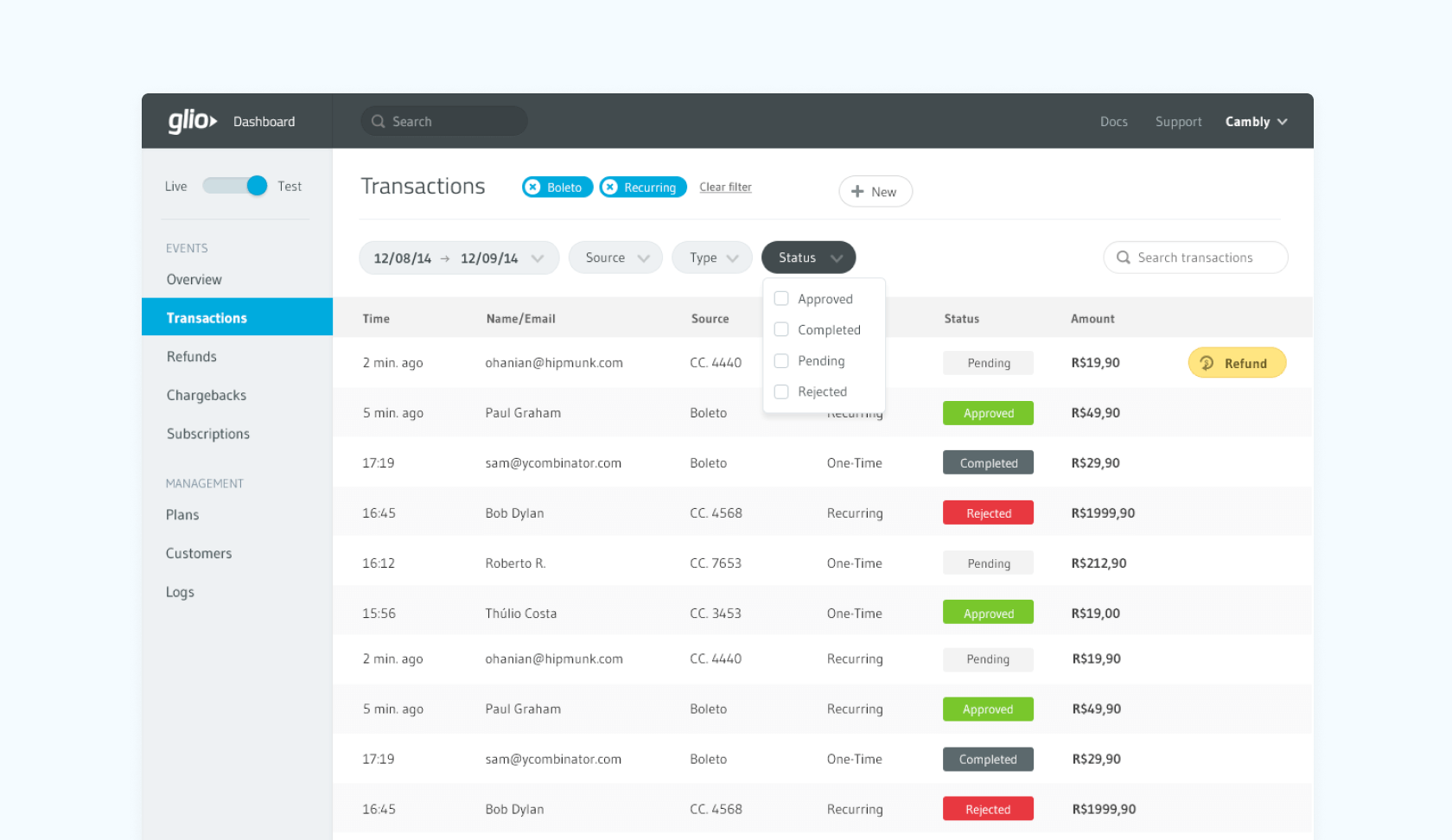 2015 - Portal MVP for companies to manage their brazilian customers transactions.
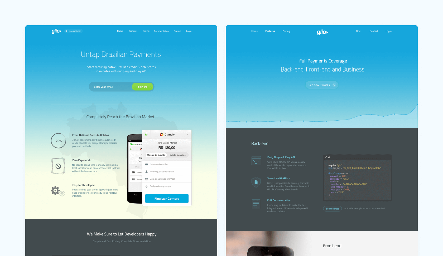 2015 - Website displaying our Stripe-like plug’n play checkout and API integrations.
 2015 - Latest home and business pages to be live before we pivoted. Winner versions from multiple A/B tests.
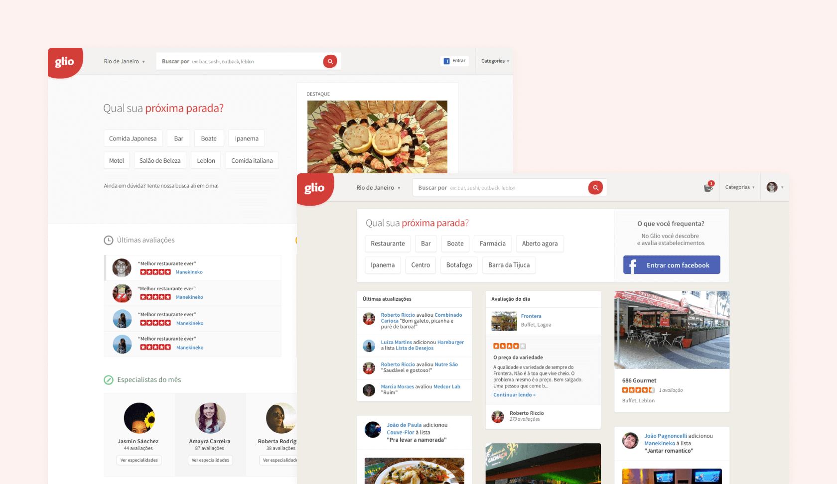 2014 - Two different A/B test experiments focused on increasing number of sign-ups. On Wayback Machine
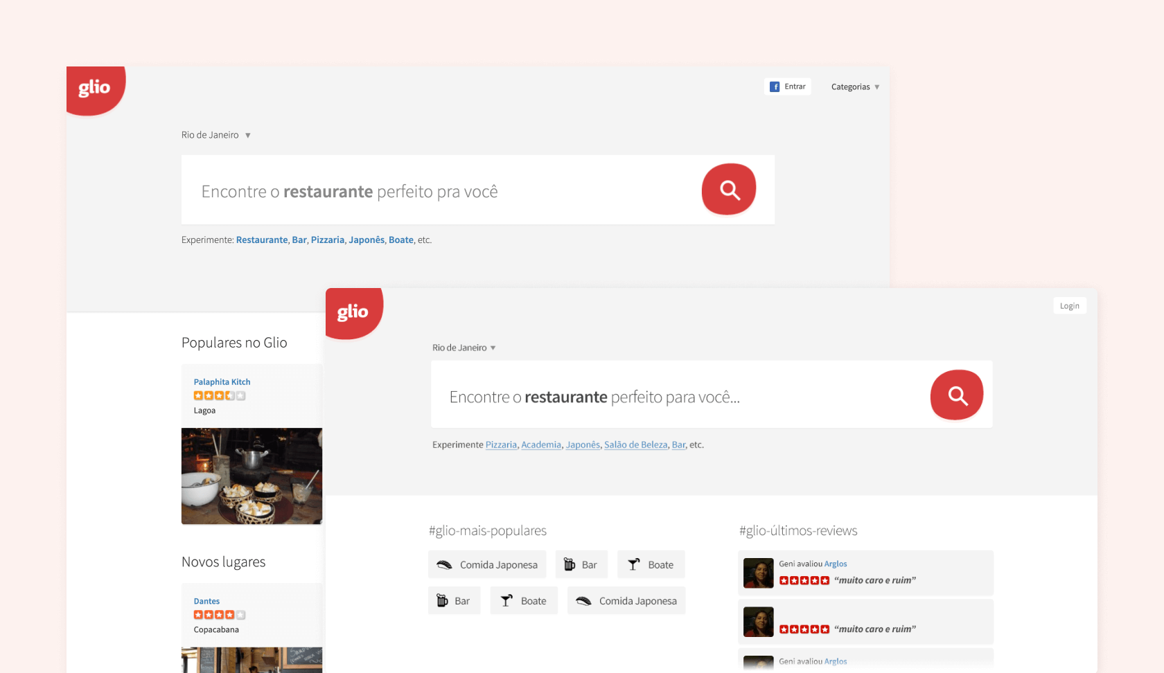 2014 - Our first websites of the data-oriented generation. We analyzed data, removed unnecessary features and got more focused on search and recommendations. First time we had metrics and A/B testing. On Wayback Machine
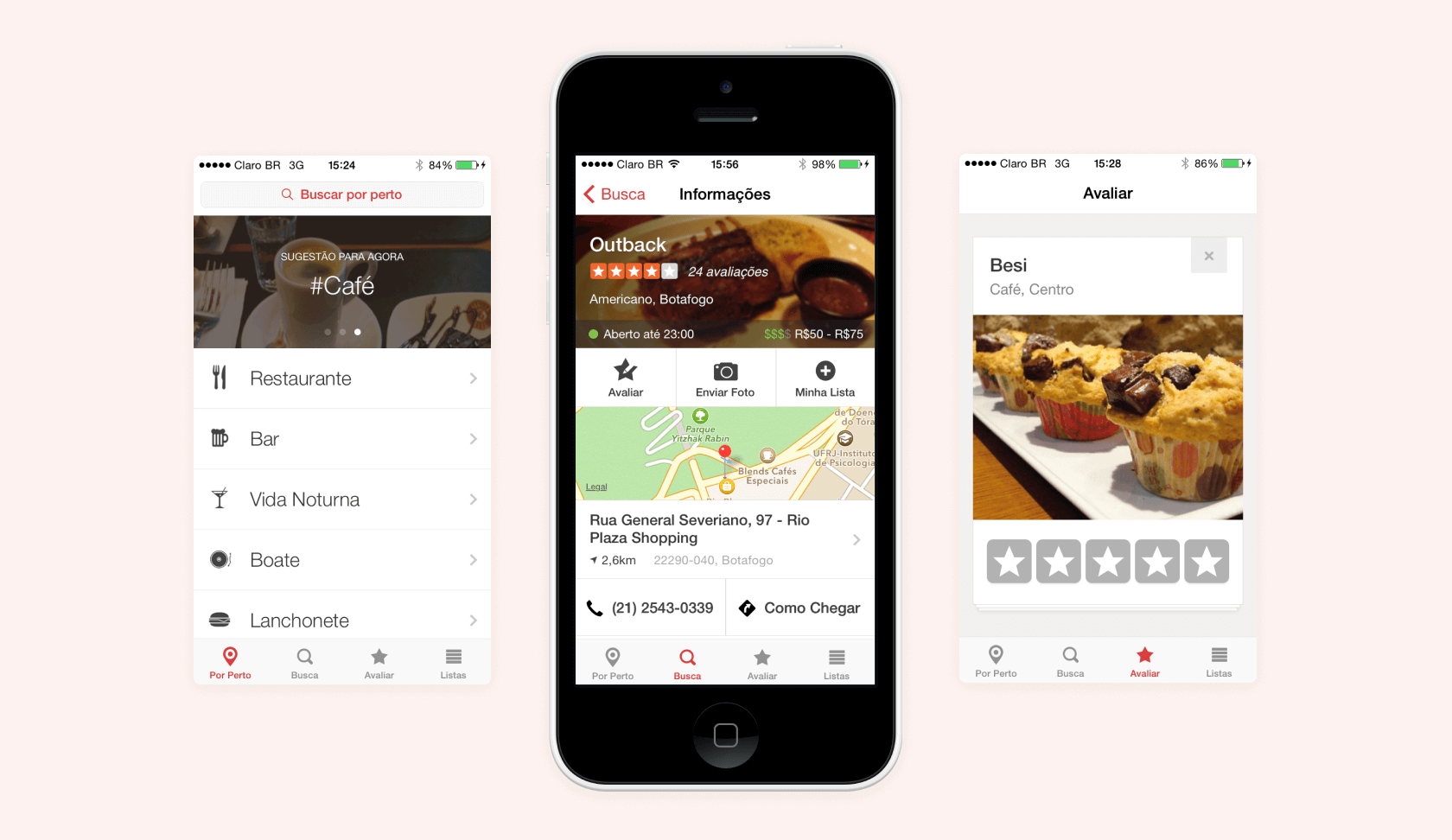 2014 - Our mobile app for iOS 9 and a Tinder-like experiment to increase number of reviews.